MICROSOFT | SALES ENABLEMENT LANDING PAGE
TLDR | Custom sales dashboards to help managers prioritize daily work
Role | Senior Product Designer
Responsibilities | Jumped into existing team to create final deliverable after project pivoted
Team | Two-person design team
OverviewTHE CHALLENGE
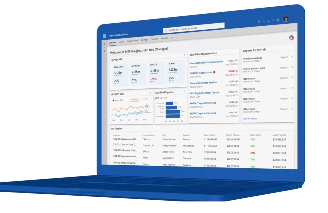
Microsoft's MSXI platform serves multiple role families across the sales pipeline, each with different priorities and workflows. WONGDOODY was brought in to redesign the MSXI Landing Page for ATU Sales Managers, building a dashboard that would help them prioritize daily work, surface key reports, and manage the Account Executives who report to them.
The core design challenge: create a system flexible enough to work across every MSXI role family, not just one. What started as a scoped landing page enhancement evolved mid-project. Microsoft asked us to move away from a static report catalog and toward something more ambitious: a true insights hub. That shift gave us room to fully reimagine the landing page experience and pitch original sales-enablement widget concepts, rather than simply reskinning existing reports.
MY IMPACT
Our team consisted of two Senior WD Product Designers, working closely with Microsoft stakeholders throughout the project. I joined to collaborate on the final deliverable design and build an in-depth deck for both stakeholders and end users.
I consolidated ATU insights and feedback from the first deliverable, then reimagined the dashboard widgets as customizable data visualizations built around key KPIs and sales insights.
Discover & DefineONE UNIFIED TEAM
Research Inputs:10 Group Interviews
40 Individual Interviews
1 Design Workshop
Research Outputs:9 Personas
~20 Empathy Maps
150 Workflows
286 Unique synthesized research findings, categorized & prioritized
HOW WE COLLABORATED
WONGDOODY and Verizon’s internal UX team, LuxCE, operated as one unified team throughout the project, integrating their foundational research and strategic plan from the start, collaborating on research strategy and design planning and jointly expanding the design system to meet vRepair NextGen's UI needs.
Together we developed Jira stories, shared new builds with development and maintained a continuous feedback loop across every design sprint, with LuxCE stepping in to help solve challenges as they emerged. By categorizing each research finding, we were able to prioritize features and screens to integrate and redesign.
WHO WE INTERVIEWED
Our research included Verizon employees and end users of both systems. We focused on understanding how engineers and supervisors used each system daily, when they needed to swivel to outside systems to work tickets and how each system could be improved.
RESEARCH ARTIFACTS


Pain Point 1:Time-intensive form completion
Pain Point 2:Heavy swiveling
Paint Point 3:Data-heavy displays
Pain Point 4:Weak search tools
Pain Point 5:Manual data validation
Pain Point 6:Inefficient ticket navigation
DevelopWORKING IN AGILE SPRINGS
CREATING PRODUCT SPECIFICATIONS
Our research findings drove our design approach. From there, we established the design and product specifications for vRepair NextGen's MVP, validating each decision with both business stakeholders and users to ensure clearly-defined outcomes were met.
Design and implementation sprints ran in parallel and WONGDOODY and Verizon's internal UX team and development team worked in lockstep to maintain momentum and alignment across every cycle.
STRATEGIZING USER ADOPTION
As the product began taking shape, we turned our focus to launch, developing a holistic User Adoption Strategy alongside a comprehensive Communication and Marketing plan to roll out vRepair NextGen across all seven centers.

Deliver GIVE USERS THE RIGHT INFORMATION AT THE RIGHT TIME

NEW LANDING PAGE DASHBOARD
Help users identify priority tickets to work and outstanding issues to address as they start their day.
SOLUTION RECOMMENDATION ENGINE
Using AI, help users identify recommended action(s) for solving tickets and provide quick access to the steps involved in taking that action.
OVERVIEWS & SUMMARIES + SHOW/HIDE PATTERNING
Show users key information about their tickets at the right time and allow users to customize their ticketing platform experience.
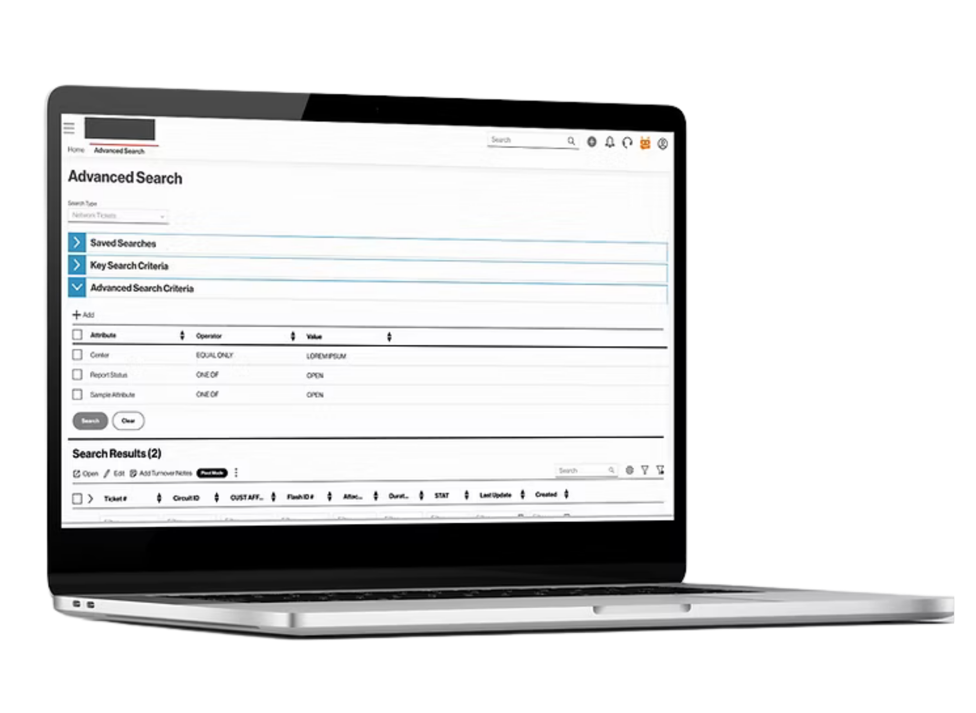
GOOGLE-LIKE SEARCH
Give users the ability to search open and resolved tickets, inventory and much more from one place using extensive filtering.
USE OF APIS & CONTEXTUAL IFRAMES
Reduce users’ need to swivel to external systems to find relevant information and validate data from vRepair.
QUICK ACCESS TO TICKET NAVIGATION
Allow users to take all actions on ticket from one place.